Category Archives: Uncategorized

Aurora Australis

Aurora Australis, title page.

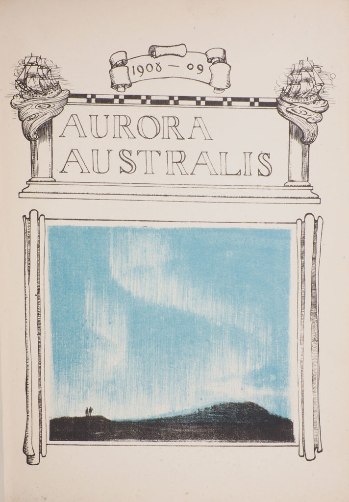
Written, printed and bound in the depths of an Antarctic winter, Aurora Australis is one of the most extraordinary of all twentieth-century books.

It was created during the fabled Nimrod expedition which took Shackleton to within 100 miles of the South Pole. As the first book printed in Antarctica it is the pinnacle of polar book collecting. The edition was printed in fewer than 100 copies, for private circulation only,  of which less than 70 copies can now be accounted for. Copies were never offered for sale, but were given instead to sponsors and others who had made the expedition possible.

In the centenary year of Shackleton’s death, it is a privilege to be introducing a rediscovered copy of Aurora Australis, with its interesting and important provenance. It will be exhibited, for the first time, at the New York Antiquarian Book Fair, April 2022.

'At the Sign of the Penguins'

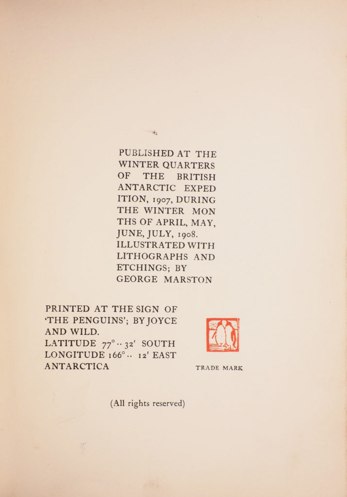
The book bears the imprint ‘Published at the Winter Quarters of the British Antarctic Expedition, 1907 During the Winter Months of April, May, June, July, 1908… Printed at the Sign of ‘The Penguins’; by Joyce and Wild. Latitude 77°.. 32′ South Longitude 166°.. 12′ East’, together with the little red printer’s mark of two penguins.

Contributions of text and images for Aurora Australis were made by all the expedition members and contemporary photographs show the two presses (one for the text, the other for plates) wedged into the cabins of Shackleton’s winter quarters at Cape Royds. Here the book’s printers, Ernest Joyce, James Murray and George Marston, pitted themselves against the elements to create a work of incredible accomplishment.

Type-case and printing press in Joyce and Wild's cubicle in Shackleton's hut at Cape Royds.

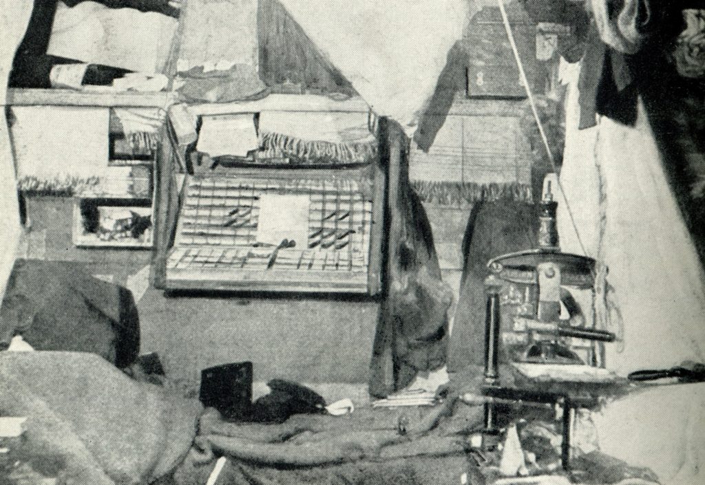
They recalled: ‘It is too cold to keep the printer’s ink fluid; it gets sticky and freezes. To cope with this a candle was set burning underneath the plate on which the ink was. This was all right, but it made the ink too fluid, and the temperature had to be regulated by moving the candle about.’ (Antarctic Days, 1913).

Inside the rear board, with fragments of the stencilled text cases 'Antarctic Ship Nimrod Lyttleton Party.

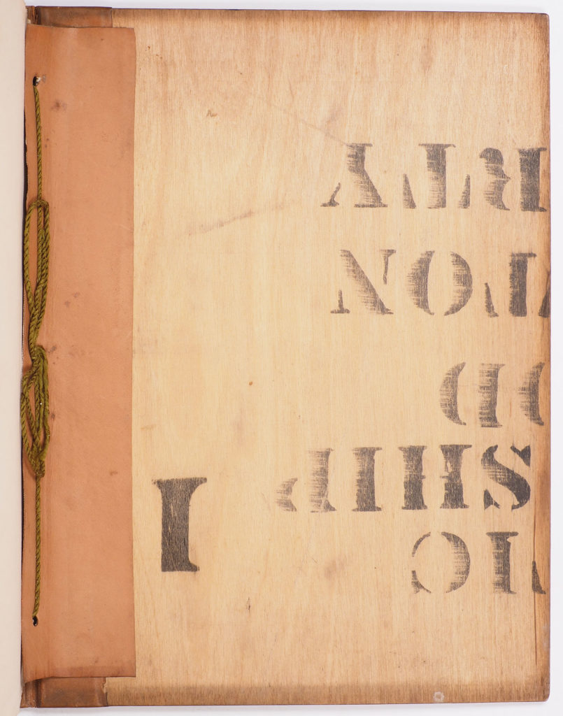
After this laborious printing process, the sheets were assembled and bound in boards of recycled plywood packing cases and backed with leather from the expedition’s pony harnesses. Each copy of Aurora Australis is slightly different, since their covers were purloined from a variety of different cases, with different stencilled labels. The lower board of this copy bears fragments of the stencilled words ‘Antarctic Ship Nimrod Lyttleton Party’.

The front endpaper of this copy also bears a pencil inscription in an unknown hand to ‘D. Kennedy Jones’, referring to Dorothy, daughter of the newspaperman William Kennedy Jones.

'D. Kennedy Jones' inscription

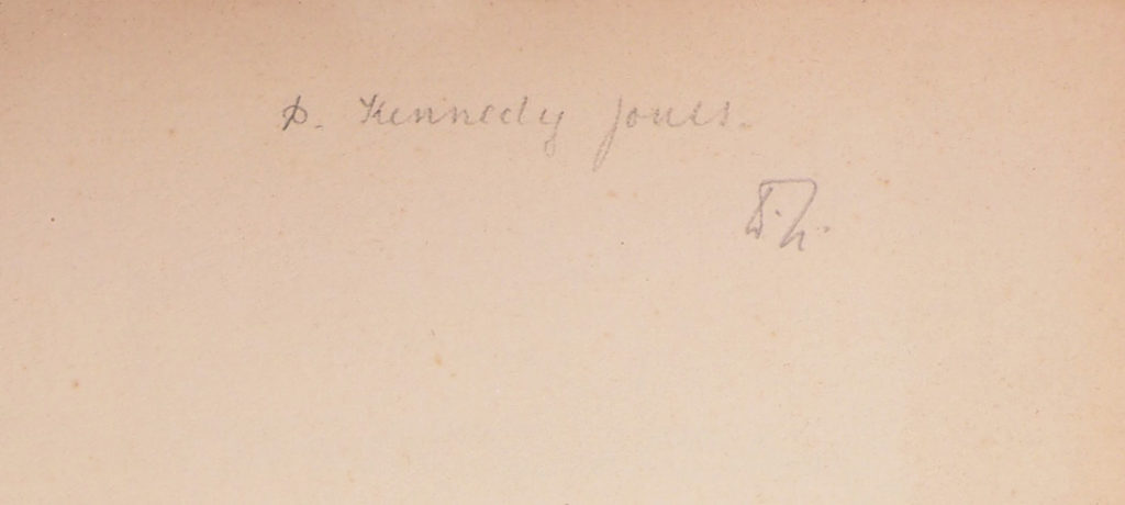
Kennedy Jones (known to most as ‘K.J.’) was Lord Northcliffe’s business manager at the Daily Mail, the newspaper which had obtained exclusive rights to Shackleton’s expedition to the South Pole, and which was the first to print news of its progress. Though the copy is not recognisably inscribed by any member of the expedition party, the proprietors of the Daily Mail would be obvious recipients of copies of Aurora Australis, though no such presentation (to either Northcliffe or Kennedy Jones) has previously been recorded. The inscription is apparently signed ‘W.H.’ and it has been suggested that this may be (or made on behalf of) William Heinemann, Shackleton’s publisher.

The Kennedy Jones copy has remained in the family, by descent, to the present day.

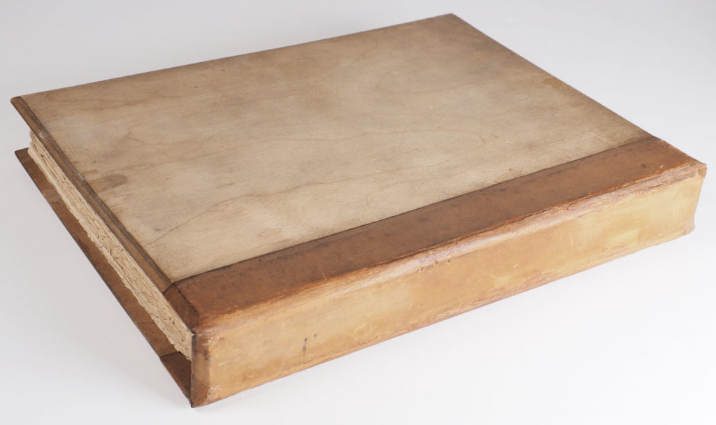
There is some variation between copies of Aurora Australis, given the mode of printing and binding, but this is a typical copy with eleven plates. A few copies have ten plates only (lacking the ‘Many shekels’ plate and having text in its place) which are argued to represent a first ‘state’ (‘Aurora Australis … A new Description of the first State’, Martin L. Greene in Book Talk, 2006). Copies can also vary in having a final caption leaf for a subsequently cancelled plate (‘A Giant Tick…’) or not. Ours is without. The most interesting variation is in the boards used for the binding, which used different sections of the many venesta plywood packing cases used for expedition supplies. Front and rear boards can bear stencilled lettering on their inside surfaces or be blank. The Kennedy Jones copy has the first board blank and the lower board with portions of the words and letters [Antarct]ic Ship [Nimro]d [Lyttle]ton Pa[rty]. The leather backing, recycled from the pony harnesses (all the expedition’s ponies perished) is fragile and prone to cracking and further degradation. Copies are often rebacked, preserving as much of the original spine as possible, but in the present copy the backing is present in its entirety, the joints  carefully and unobtrusively repaired by James Brockman.

‘At most 100 copies were produced, but probably significantly fewer. Approximately 65 copies have been accounted for to date. At this time, about half are in museums or permanent institutional collections and half are in private hands’ (Rosove, 2001). The present copy was not known to Rosove and does not appear in Martin Greene’s Antarctic Circle census online. It is an important rediscovery. Please contact us for further details.

4to (260 ×165 mm), 93 leaves, including blanks, colour printed title and 11 plates. Bound by Bernard Day in original ‘venesta’ boards taken from expedition packing crates, backed with leather from recycled horse harnesses, title and penguin motif stamped in blind on spine, green silk binding cords, edges uncut as issued. Boards and spine slightly soiled, spine rubbed (both title and penguin device still visible), joints expertly and unobtrusively repaired. An excellent copy.  

See: Rosove, Antarctica (2011), 304.A1.b; Spence 1095; Taurus Collection 60.

Diane de Bournazel – Autumn 2021 Exhibition

We are excited to bring new works by Diane de Bournazel, the internationally-renowned French book artist, to the 2021 Salon du Livre Rare in Paris.

This will be the largest gathering to date of Diane de Bournazel’s books, with 10 recent works exhibited. Diane’s work has found admirers all over the world and is represented in both private and public collections. She will join us during the Salon preview.

Immediately recognisable, her works push the boundaries of the codex form to the limit without ever losing sight of the traditions and unique technology of the book. Filled to the utmost with her characteristic iconography, each book is an adventure in time and space.
In the words of this week’s La Gazette Drouot, the pages of Diane de Bournazel’s extraordinary books contain tous les secrets et experiences de la vie’  (Christophe Dorny, La Gazette Drouot, September 2021).
What more could we ask?

Please join us for this very special exhibition at the Grand Palais Éphémère, Paris
24 – 26 September 2021

About the Artist:

Born in Paris in 1956, Diane de Bournazel grew up in Toulouse, the United Kingdom and Italy. She showed a passion for art from an early age and resolved to dedicate her life to it in 1975. She is largely self-taught. Her earliest works, in the form of large portraits drawn from photographs, show the influence of Ernest Pignon-Ernest, but she soon turned to abstraction in the spirit of Klee and De Staël. In 1985 she moved to Corrèze, the region of the Limousin from which her family originated, before relocating to Paris in 1990. There in the capital she found herself short of both time and space, leading her to adopt the format of the miniature. With ink and watercolour she filled the pages of many notebooks. Thus was born the unique and profoundly personal universe of Diane de Bournazel.

1995 marked a second and definitive move to Corrèze. she found the ideal place for her creative language to flourish and it was here she pursued her protean practice as a painter (on canvas, slate, glass…), illustrator and engraver. The artist moves freely from one medium to another:  from painting to sculpture, from monotype print to tapestry, always in a manner both patient and minute.

In all this the book holds a place apart for Diane de Bournazel. Combining drawing, painting, papercutting and collage, her books emerge like sculpture or medieval illumination. Within them — as in her day-to-day environment, surrounded with objects freighted with meaning — the artist demonstrates an aversion to empty space. Everything is a source of inspiration, but her rich visual repertoire, mysterious and magical, occupies the smallest of physical spaces. The images have the density of a forest and every page offers continual discoveries and new surprises, poised between marvel and introspection, between levity and gravity. Deeply personal, Diane de Bournazel’s books invite interaction, inspiring both dreams and meditation with a kind of poetry in which form has replaced words.

In this truly organic work, it is the sense of line which dominates. Fluid like music and with the movement of dance, the artist applies to each page motifs with a simple and universal appearance, immediately comprehensible by all. Her characteristic palette draws on sober, natural ink shades anchored firmly in the earth, but enlivened by the vivacity of distinctive blues, reds and yellows. Thick handmade paper becomes evanescent in the hands of Diane de Bournazel. Windows cut into the superimposed layers of successive pages often allow us to see both the beginning and the end of these books simultaneously, throwing into question the expected notion of narrative, time and space.

Passionate about poetry, Diane de Bournazel regularly collaborates with poets in her published books. She has also worked in the world of children’s books. Her artist’s books, however, are all unique.

(Valerie Douniaux, trans. Justin Croft)


What did Leopold Bloom look like?

The earliest Ulysses illustration rediscovered.

James Joyce's sketch of Leopold Bloom, 1926, now at McCormick Library of Special Collections, Northwestern University (IL)

If you search online “what did Leopold Bloom look like?” you’ll immediately find the sketch above made by James Joyce in Paris in 1926. Joyce was recovering from one of his many eye operations, and the sketch is rough to say the least, but in a few smudges Joyce drew out Bloom’s essential hat and moustache. Joyce had earlier told Sylvia Beach that Bloom resembled the English journalist and bibliophile Holbrook Jackson (who sported unruly hair and an unmistakeable moustache) but Joyce’s sketch has been universally considered Bloom’s earliest representation. It is preserved at the McCormick Library of Special Collections, Northwestern University (IL).

Mariette Lydis, illustration, 1925, from the journal "900" Autumn 1926

We have recently come across a published illustration bearing a date at its bottom right-hand corner ― 1925 ― which is likely to be not only the earliest surviving depiction of Bloom but also the earliest published illustration for Ulysses. It is by a remarkable Austrian-born artist Mariette Lydis (1887-1970), whose career encompassed Vienna, Berlin, Paris, Winchcombe (briefly) and Buenos Aires. Her illustration, which accompanies a French translation from Ulysses published in the Italian journal “900” in 1926, has been entirely overlooked by Joyce scholars until now. It shows a crumpled everyman figure, with black hat and moustache and accompanies the ‘Calypso’ episode in which we are introduced to Bloom (and his enthusiasm for kidneys). Its original has not been traced.

Mariette Lydis, illustration, 1925, from the journal "900" Autumn 1926

Ulysses has been peculiarly resistant to illustration. Its first illustrated edition of 1935 included etchings by Matisse, but his stylish illustrations have more to do with the classical Ulysses and certainly don’t show Bloom. Matisse probably never even read Joyce’s novel. British pop artist Richard Hamilton pursued a long quest to illustrate the novel over several decades from 1948 but the project was left unfulfilled. More recently John Vernon Lord has published one of the only complete sequences of Ulysses illustrations, for the acclaimed Folio Society edition of 2017.

With such a dearth of iconography for such an iconic literary figure it seems extraordinary that Mariette Lydis’s illustration has so completely eluded study by Joyce scholars. It’s a complicated image ― what are we to make of the background details (a brazier, a spider’s web and holiday posters for the Dutch resort of Ostend) which don’t bear much relation to Ulysses? One might object that it’s just any crumpled man in a black hat, except that it has been placed so deliberately with the Ulysses text in “900” (a journal of which Joyce was, at least nominally, a joint editor). It is clearly labelled ‘Illustration’, where the other images in the journal by other artists are simply described by their media (‘dessin’) and bear little relation to the texts. Somehow then, this image stands for Bloom and is almost certainly the first to do so.

There was clearly a connection in the mid-twenties between artist and author, via the Italian writer Massimo Bontempelli, who was then Lydis’s lover and editor of “900”. Whether they had met before 1925 is probably not known, though a pencil portrait of Joyce made by Lydis in Paris is dated 1926 (see Cheng, James Joyce Broadsheet, 11, October 2018).

There is a story here to be uncovered. What influence, if any, did Joyce have over Mariette Lydis’s Bloom? Had she read the episode? Perhaps more interestingly, what influence did her illustration have on Joyce’s own conception of his character and on future interpretations? It has even been pointed out that Joyce’s partially-sighted scrawl of 1926 is merely a bad copy of Lydis.

There is clearly much more to say about the prospect of this ‘new’ iconography for Bloom ― already nearly 100 years old.

This new discovery was noted in the Times Literary Supplement on Bloomsday 2021.

Mariette Lydis, illustration, 1925, Ulysses excerpt, from the journal "900" Autumn 1926 The journal "900" Autumn 1926


The Enchanted World of Diane de Bournazel

‘Poésie sans paroles.

Il s’agit bien de ça.

Mettre en images le monde et l’arrière monde,

Comme un poète mais sans mot dire’ 

For several years we have been proudly exhibiting new work by the renowned book artist Diane de Bournazel. We try to have at least one example on show at each of the fairs and exhibitions we show at. Please check our current offerings at www.justincroft.com or with Librairie Solstices in Paris.

Diane de Bournazel makes unique books ― each an enchanted universe. Days of painstaking drawing, hand colouring, collage, papercutting and binding combine to create unique stories-without-words which are richly-layered, poetic, moving, and occasionally breath-taking. Her books find admirers and devotees wherever they are shown and have become highly prized by collectors.

As a book artist, Diane de Bournazel is among the very best in seeing the livre d’artiste as a total artistic creation, embracing all the special qualities of the codex form. She creates distinct and mysterious narratives, spurring us on to turn the pages, with her trademark papercutting opening windows between them, encouraging us to look forwards, backwards and beneath the surface. Subtle collage effects and gauffered edges invite us to touch the pages and to reanimate the books each time we return to them.

Her themes are those of life and death itself, of childhood, love, loss and longing. Recognising that everyone experiences these universals as part of their own unique story, De Bournazel’s visual meditations are always open to interpretation and reinterpretation. Every encounter, even with the same book, yields new insights as new details appear and new connections are noticed between the pages. This is a rich symbolic world, full of unexpected resonances and symmetries.

Diane de Bournazel (b. 1956) is a painter, printmaker and book illustrator and has illustrated many books in France, especially contemporary poetry. Her unique books are represented in both private and public collections in France and further afield, with examples of her unique books held by the BIbliothèque nationale, the Bibliothèques municipales of Nice and Toulouse and the artist’s book collections of the Boston Athenaeum. Some of her livres d’artiste have been reproduced digitally and published, but each of the works we offer is original and unique.

Literature: ‘L’Univers enchanté de Diane de Bournazel’, Art & Métiers du Livre, 316, 2016, pp. 24-31.

Diane de Bournazel crée des livres uniques autant d’univers enchantés.  Ces récits sans paroles sont peints et découpés, fragiles et harmonieux univers de papier, architectures d’encre, de gouache, de pigments et de collages.

Les voyages symboliques de  Diane de Bournazel embarquent le cœur et la raison. Son domaine graphique, nourri de poésie, s’étend en rhizomes. De sa main, avec le pinceau, la plume, la lame éclosent entremêlés des corps protéiformes, une flore foisonnante, une faune fantastique. Dans un virtuose jeu de plans-miroirs, rêves et souvenirs glissent, bondissent, s’envolent, plongent des surfaces aux profondeurs. Entre les bordures rythmiques se déploie la ronde de l’enfance, du désir, des amours, de la mort. Le manque se fait ajour, le tourment retournement. Parce que chacun a une expérience intime de ces thèmes universels, les méditations visuelles de Diane de Bournazel sont toujours ouvertes aux interprétations et réinterprétations. Chaque rencontre, y compris avec le même livre, est une révélation : de nouveaux détails apparaissent, de nouvelles connexions se laissent deviner entre les pages et invitent à regarder plus avant, à revenir en arrière et à passer sous la surface.

Diane de Bournazel, née en 1956, épanouit  à Marliac, en Corrèze, une œuvre singulière. Ses livres uniques sont des oeuvres rares à la maturation lente, essaimées chez les amateurs et dans quelques collections publiques. Aux Etats-Unis : Boston (Athenaeum), San Francisco (Center for the Book). En France : à Paris, Bibliothèque Nationale de France, Bibliothèque Forney, Bibliothèque de l’Heure Joyeuse, Bibliothèque Faidherbe ; en régions : Bibliothèques de Limoges, Nice, Médiathèques d’Arles, Bordeaux, Brive, Cahors, Chartres, Issy-les-Moulineaux, Montauban, Saint-Quentin-en-Yvelines, Toulouse, Tulle…

Bibliographie : « L’univers enchanté de Diane de Bournazel », Arts & Métiers du livre, 316, pp. 24-31.

I have a confession…


Bless me father, for I have sinned… So began the Catholic sacrament of confession as I remember it from thirty years ago, having made my ‘first confession’ at the Church of St Hugh’s, Buckden (Cambridgeshire) in the late 1970s. At least twice a year my siblings and I would wait uneasily in the pews at the back of church preparing for five minutes of toe-curling embarrassment with one of the parish priests as we stumbled through our short list of pre-adolescent failings: disobedience, showing disrespect to our elders, laziness, lying, cheating, sometimes stealing.

It’s arguable how beneficial all this was for the juvenile mind, and perhaps that’s beside the present point. I was glad however when in the 1980s individual confession came to be replaced by services of ‘general absolution’. These meant you didn’t have to name your sins out loud, which was probably for the best as we passed through our teens. In truth, one-to-one confession wasn’t as bad as it sounds and was approached seriously in our family, albeit with a certain grim humour. The ‘confessional’ in 1950s-built St Hugh’s was nothing like the comedy baroque chambers you see in the films—it was more like a well-maintained public convenience. If you were lucky, it would be Father Rourke behind the curtain, who was rather deaf and whose gentle Irish accent was so impenetrable that you couldn’t be upset by his response. He would listen to your confession and then invite you to consider ‘crushing the head of the serpent’, sending you away to recite three Hail Marys or an Act of Contrition.

The challenge for us children was to come up with a sensible and credible list of sins, usually confined to the basics—non-controversial but without sounding as though you were reading from the same list every time. A story told by our grandmother warned us of the dangers of anything too outré—as a convent-girl in the 1920s she had confessed to adultery and it had caused a stir. Invited by her confessor to elaborate she explained that she had been seen wearing an under-vest in public and that, even worse, she had borrowed it without permission from another girl.

A brilliant solution was devised by our little sister in the form of a tiny, clandestine manuscript scarcely bigger than a communion wafer. It consisted of a few stapled pages on which were written, in minute script, a goodly range of childish sins. The manuscript could be concealed in the palm of the hand and served as a peccatorial aide-memoire once in the confessional; if you opened the pages at random, the laws of chance took care that sins would be rehearsed in a different sequence every time. For a consideration, our sister would lend it to her brothers, and so the little book would be passed along the pew and then put away, concealed in a sock drawer, until the next time. Bless me father, for I have sinned…

However, I realise we were not the first to come up with this solution. In fact, in the seventeenth-century cleric Christophe Leuterbreuver, had published a remarkable little pocket book along this line which became a bestseller, running to numerous editions. It was more than just a list though—being a fully-fledged livre à système incorporating hundreds of folding slips. I have now owned several copies of this book, the earliest being printed in 1695 the latest in 1751.

Designed as a practical aid to the sacrament of confession Leuterbreuver’s ingenious little work first appeared in 1677 and ran to many editions. Intended as a complete manual of confession, the moveable slips provided a solution to the problem of making a full and detailed confession from memory. The sinner can mark the entries relevant to him or her by lifting the corresponding printed slips and then replacing them later so that no-one need ever know what was confessed. In reality, the lifted slips were often folded to mark them more clearly and it is, of course, intriguing to see which of the hundreds of sins have been marked. In the copy I have on my desk now very few of the slips are folded, but the one printed: ‘I have often had the name of the devil in my mouth’ is very clearly marked.

The book as a whole provides an uncommonly intimate view of the soul, akin to listing at the door of the confessional. The sins are set out according to the Ten Commandments and provide a glittering array of human failings. This is not a book for children and one wonders whether its popularity was as much because it provided such a panorama of the dark side of the soul. The list of sins for the ninth commandment, for example includes memoranda for ‘Avoir eu des pensées & des désirs lascifs. Y avoir eu de la délectation… Avoir prêté consentement aux illusions nocturnes… Avoit employé l’art magique des breuvages, & choses semblables, pour engager quelque personne en amour… Avoir dit des chansons lascives. Avoir dit les contes, & tenu des entretiens lascifs. Avoir fait des billets & écrits lascifs. Avoir eu, lû, & donné les Livres                                                    lascifs… Avoir jetté des regards déshonnêtes…

My grandmother’s confessors might have blanched at the sight of it, but she herself would have been intrigued and perhaps just a little amused. And I hope Father Rourke will forgive me for writing this post.

An Angel of the North

This time last year, I had just returned from a visit to Scandinavia. In my bag was this tiny book, found on the shelves of a Copenhagen bookshop, where it was hidden in the triple-shelved books of the theology section, wedged beside the water pipes. I had recognised the binding as being in the style of the Guild of Women Binders, with its modelled goatskin covers. Though an old pencilled note in the front suggested that the cover depicted Pan with his flute, the image looked more like a Burne-Jones angel to me.  The book itself is an unremarkable edition of the Imitatio Christi by Thomas a Kempis. The binding is dated 1896.


National Museums Liverpool

How long this angel had been in Denmark I just don’t know. Home in Faversham, a few minutes internet research brought up the source of the image: Edward Burne-Jones’s Angel playing a Flageolet, painted around 1878, now at Sudley House, Liverpool. Of course, it’s one of a veritable host of Burne-Jones angels: they were both his signature and his credo, brought to life in countless paintings, tapestries and stained-glass windows and endlessly reproduced. In 1882 Oscar Wilde recalled Burne-Jones telling him: ‘The more materialistic science becomes, the more angels I shall paint: their wings are my protest in favour of the immortality of the soul’. He seems to have been particularly fond of this musical angel, keeping it in his studio for ten years before parting with it. How did our angel migrate to find itself on a bookbinding? The answer has been provided by Graham Hogg of the National Library of Scotland (who have acquired the book) and is written up on their website:

http://www.nls.uk/collections/rarebooks/acquisitions/singlebook.cfm/idfind/849

Trustees of the National Library of Scotland

In short, Graham recognised the binding as a product of the late nineteenth-century Edinburgh school of bookbinding founded by Annie McDonald soon known as the Edinburgh Arts and Crafts Club. The work of McDonald and her followers (almost all women) is characterized by these moulded goatskin bindings, where the leather has been worked while wet, with a single tool, pushing and squeezing it into relief, with remarkable effect. When new, their bindings were probably much whiter, only mellowing with age. The Edinburgh group were important, since it was they who inspired the foundation of a larger national organization, The Guild of Women Binders, who made and exhibited many hundreds of innovative book bindings over the coming decades. Their work was very much in tune with the Arts and Crafts Movement, creating objects of beauty and utility which contrasted with increasingly mass produced goods. Women played an important part in this. In mass factory production it was often women who provided cheap deskilled labour of stultifying tedium; one of the aims of The Guild of Women Binders was to allow women to relearn and revive traditional skills in a creative environment.

The binding has been positively identified as the work of one ‘Miss Maclagan’, probably a pupil of Annie McDonald, who has carefully copied a detail of Burne-Jones’s original, probably from a photographic reproduction. Graham Hogg has also discovered that this very book was exhibited at the 1898 London exhibition of the Guild, where it was item 93 and exhibited as an example of the work of the Edinburgh School.

It is one of the great pleasures of bookselling to see books find appropriate homes. There can be no better home for this wonderful binding than the National Library of Scotland.

An angel returns to roost in the city of its birth.

upper cover & spine


lower cover

On paper…

A few days ago I visited the ancient town of King’s Lynn. It was a memorable trip, not least for being booked-ended by glimpses of the great medieval cathedrals of Peterborough (underrated, I think) and Ely (the much-loved ‘Ship of the Fens’). Lynn, once one of the busiest sea-ports in Europe, had an eerie autumnal quietness; low clouds hung over the fenland approaches and the tide was disquietingly high in the Ouse estuary.

I spent some time in the borough archives, still housed in the Town Hall (access via the Old Gaol House). The medieval town archives of Lynn are breathtaking and include one of the finest collections of town charters in the country. But for me, the highlight was an initially unprepossessing paper book now blessed with the name of ‘The Red Register’ after its later binding. The register is a collection of town documents written up in this book from the year 1307. After turning some of its leaves and admiring the handwriting I put the register back in its archive box and made a brief note: ‘paper book; 1307; ?early’ and moved on.

In the early fourteenth century England’s writers habitually wrote, as we all know, with quill pens on sheets of parchment or vellum. And that’s true of writers in a variety of fields: in the church, the law courts, or in royal and local government. Here in Lynn, in 1307 we find a medieval writer (or probably writers) writing on quires of paper with the clear intention of binding them up as a book. The paper could not, of course, have been English: the first recorded English paper mill dates from only the 1490s, when a Hertford paper maker supplied paper to the printer William Caxton.

It was only after I returned home to Faversham (which coincidentally has a pretty mean collection of medieval charters) that I realised just how early the Lynn paper book was. In fact, consulting the endlessly-useful classic by Michael Clanchy From Memory to Written Record, I found that: ‘The earliest records made in England on paper come most appropriately from major seaports: a register from King’s Lynn beginning in 1307 and another from Lyme Regis in 1309’.

The King’s Lynn Red Register is then, the earliest surviving English paper book. I realise that, had I been paying attention, I would have noticed it even has its own blue plaque outside the town-hall, though it doesn’t tell us why it’s important.

It’s a common (and fair) assumption that paper books have something to do with printing. Books are printed on paper. There are a few black-tulip exceptions, usually very early (a few copies of the Gutenberg Bible and other incunables, including Caxtons, and of course a few copies of the wonderful Kelmscott Chaucer and other private press books; late revivals of vellum printing). There’s also a co-incidence of chronology: paper making, especially in England, takes off with the advent of printing. Conversely, we tend to think of medieval manuscripts as written on parchment or vellum.

On reflection I can now think of several examples of English medieval manuscripts on paper, mostly urban or legal registers from the fifteenth century (there’s even one here in Faversham). A few date from the period before printing, but very few from the fourteenth century. That makes the 1307 Red Register at Lynn truly remarkable.

It speaks of a confident leap-of-faith on behalf of the town government to make an important civic record on a material with such a short track-record in practice. Of course we know that Chinese and Islamic cultures used paper long before, but the first paper mills in Europe were not active before the 1270s (in Italy; where else?). Urban records were not mere shopping lists: they were the documents used by powerful ruling elites to protect the data which allowed them to carry out their day to day business in the knowledge that they were acting correctly and lawfully. Town documents were jealously guarded and treated with all the care and respect that a major business corporation would use to maintain and back-up its databases. That is one reason why medieval town records have such a good rate of survival.

To experiment with paper as a record-keeping technology was a brave and forward-looking move in 1307. Probably before its time, since it didn’t catch on for so long. Paper would turn out to have all kinds of advantages over parchment: it can be less bulky, it allows for much more rapid writing in new, faster hands, and ultimately it would become cheaper. By 1500, except for deeds and charters, paper would become dominant in record-keeping of all kinds. Perhaps most significantly, in the long run, it provided a perfect surface for printing.

I’m fascinated by the people who made medieval administrative records. It seems to me that, just like the IT wizards of the 21st century, it is they who were experimenting with new technologies for recording day-to-day experience. The Red Register of Lynn is perhaps just one example of how far ahead of their time they could be. They were often people of extraordinary capability and imagination. It’s no coincidence that people such as Geoffrey Chaucer, controller of customs at London, was also a full-time administrative writer. It has been argued that the explosion of English lay-literacy in the fourteenth century came about in part through advances in literate technology among administrators in the great towns of England. That is another story and one I’m certainly encouraged to revisit after my archival explorations at Lynn…

publication of an Antiques Roadshow discovery – war poet Timothy Corsellis

The Unassuming Sky: The Life and Poetry of Timothy Corsellis by Helen Goethals

Last year, while recording with the BBC’s Antiques Roadshow I unpacked an old suitcase of papers belonging to the largely unknown Second World War poet Timothy Corsellis. Among the papers were notebooks containing over 100 unpublished poems, many on the subject of the war itself. I’m delighted to say that the poems have now been published, as part of a masterly biography by Helen Goethals.

The Unassuming Sky - Timothy Corsellis

Pilot Timothy Corsellis died at the controls of his plane when it crash-landed on October 10th 1941. He was not yet 21. The poems he left behind were recognised for their quality and importance, with a small number appearing in anthologies of war poets. He also receives a brief notice by Ronald Blythe in ODNB. In life he was recognised as a rising talent, and attracted the notice of contemporary poets, including Stephen Spender who he met and who penned a posthumous poem in tribute to him.

The story told by the 100 poems we found in the Roadshow suitcase was too complex to tell in all but the briefest details in a few minutes of screen time. Corsellis trained with the RAF as a fighter pilot as the Battle of Britain was being fought in the skies above Southern England. Like so many young men of his generation he wrestled with the morality of war. While fully convinced of the evils of the Nazi regime, Timothy’s deeply-held Christian values were challenged by the onset of war. He was initially an objector, then enrolled with RAF.

In 1940 Corsellis was assigned to bomber training; at which point he was hit, head-on, by the moral dilemma which would ultimately end his life. The dilemma is prescient, even in 2012, as debates over the ethics of bombing civilians in war are ever present, not least in the context of the memorial to the pilots of the Second World War’s Bomber Command, constructed only this year in London.

Corsellis requested a transfer to a fighter squadron or the Fleet Air Arm, where his targets would, at least, be military. His request was met with refusal and an honourable discharge from the RAF. As a relief worker in London’s East End he then observed the realities of civilian casualties during the Blitz; which he recorded in some of his best poems, such as ‘Dawn after the raid’. Having described the discovery of another body among the ruins, he asks:

Relief work in the London Blitz

‘Is it for this that bending we strived

And fought in each other’s blood and other’s sorrow

To reach these wretched mangled remains?

Is it for this that we ached in the darkness

Not knowing that nearby

Another house had fallen

To the blast of that same bomb.’

Like  others of his best poems, it evokes the terrible realities of death in war and the fresh dilemmas facing the living at every turn. Corsellis tackled these questions bravely; always with a human background. This is one reason why his poetry remains so relevant today.The poet then saw service as a transport pilot with the Air Transport Auxiliary (A.T.A.), delivering planes and supplies, and it was during a routine flight from Luton to Carlisle that his Miles Magister L8268 stalled, crashed, and ended his life.

The Unassuming Sky includes 100 poems presented within the framework of a sensitively researched biography by Helen Goethels, who was granted full access to the family’s papers and personal memoirs. Her study is alive with interconnections and influences which helped to shape the work of this important war poet.

The credit for bringing the poems to publication after more than 70 years goes in large part to the poet’s brother, John Corsellis. It was he who brought the suitcase to the Antiques Roadshow and who created such a memorable impression while discussing on camera what the artefact meant to him.  It was the broadcast of this discussion which found the poems an agent and led to publication with the Cambridge Scholars Press.

The book can be ordered direct from the publishers or from all good bookshops.

A. Maurice & Co’s First Folio

Since my first post ‘to being at the beginning…’ on the firm of A. Maurice & Co, founded by my great-great-grandfather, I’ve been fortunate to receive lots of suggestions, corrections and facts from friends and family. I hope to incorporate these here and in future posts.

Most importantly Simon Hicks pointed out my confusion between the two Armands, father and son. Armand (born 1824) my great great-grandfather founded the firm of A. Maurice, but later in the century it was run from Bedford Street by his son Armand (born 1865) my great grandmother’s brother.

Shakespeare, First Folio, 1623

This week I have been pursuing a chance reference I found to the Shakespeare First Folio (1632) sold by A. Maurice & Co in August 1896. To my delight, the copy had been tracked down by Anthony James West shortly before publication of his Census in 2003 and appears there as West 213. The copy still exists and is in Japan – apparently having been the very first copy of the First Folio to arrive in Japan.

A. Maurice acquired it in the 1890s and quite quickly sold it to the Cornish tin magnate John Claude Daubuz. It was sold again in 1932 (Sotheby’s, 25 July, lot 129A) and bought by Marks for £100.  It apparently then migrated to California, being sold by Dawson’s in Los Angeles in the same year. The next we hear of it is when sold jointly in 1969 by the British firm H. M. Fletcher and Japanese firm Yushodo to a Mr Kamijo in 1969 for £6,400. Lee’s enquiries suggest the copy was still with the Kamijo family in Japan in 2001.

1895 – la fin des livres?

listening online

She’s relaxing on the sofa with her headphones on; her friend is listening to a novel. Between them they can get hold of pretty well anything they choose to hear – literature or music – channel-hopping from dance to Wagner to poetry or from philosophy to novels. The year is 1895 and the days of reading from printed books seem to be numbered.

At the dawn of the electrical age the Parisian publisher and dandy Octave Uzanne and his friend, Albert Robida, a science-fiction author and illustrator, imagined a new literary world. The printed book was replaced by a subscription service where access to books and music was provided in the home with electrical gadgets wired to a central network. Those without the necessary equipment at home were not excluded and could get pay-as-go access from listening points in public places or on public transport. Libraries were repositories for recorded sound, and books existed as audio recordings, preferably in the voice of their author. Uzanne and Robida’s fantasy was published as ‘La fin des livres’ in Contes pour les Bibliophiles (1895).

Contes pour les Bibliophiles, 1895

Uzanne was a bibliophile who foresaw the potential of electronic publishing. But he also saw that printed books could survive in the coming era by becoming objects of desire. He understood that reading was not just an intellectual activity and he set about creating books which were not only beautiful, but which took delight in doing things that only books could do. He relished the power of the well-designed cover and the excitement it brought to the opening of a new book for the first time. He sometimes added extra jackets in embroidered silk with ribbons and laces to be untied. Texture was important. Paper was carefully chosen and decorative tissue guards protected the many illustrations to provide a whispered rustle as the images were revealed. Text and illustration were luxuriously combined on almost every page. His books were the bibliophilic equivalent of a collector’s vitrine, stuffed with exotic (and sometime erotic) exhibits in a heady mixture of graphic styles.

Octave Uzanne was not sentimental about his books. They didn’t, for example, hark back to an imagined golden age, and his project was entirely different from the Arts and Crafts movement across the English Channel which was busily recreating the book arts of the past. Uzanne loved technology as much as his sci-fi friend Robida. The two of them haunted the Paris Expositions looking for new printing techniques to perfect their colour plates. While their books were designed to appear exotic and exclusive, they were affordable and widely available. Certainly editions were limited, but they ran to 1000 or more copies in most cases.

These works are steeped in the fin-de-siècle Paris scene but some of Octave Uzanne’s thoughts and predictions on the relationship between print and changing communication technologies have become relevant to today’s ‘death of the book’ debates and to contemporary developments in publishing.

If you’d like to read more there is an excellent book on the Parisian bibliophilic scene of the 1890s, with lots of material on Octave Uzanne: The New Bibliopolis. French Book Collectors and the Culture of Print 1880-1914 by Willa Silverman (University ofToronto Press, 2008). http://www.utppublishing.com/The-New-Bibliopolis-French-Book-Collectors-and-the-Culture-of-Print-1880-1914.html